Safeguarding MSD Animal
Health’s market share in
the parasite segment
MSD Animal Health is a worldwide company dedicated to improving the health, wellbeing and performance of animals. Scalibor is a product brand within the companion animals sector. It is a collar that protects dogs from multiple parasites, including ticks, mosquitos and sand flies. Many of these parasites can transmit serious diseases, such as Leishmaniosis and Lyme disease.
Challenge
Rebrand the visual identity and packaging of Scalibor to solidify the position of the product in the market. This was necessary due to the presence of direct competitors offering collars with improved features, as well as new solutions such as chews and pour-ons entering the market.
Result
A refreshed visual identity infuses the Scalibor brand with a genuine sense of purpose, direction, and personality:
- A personality characterized by positivity, friendliness, and impact.
- A direction that challenges the norm, featuring packaging designed to stand out on the shelf and capture attention.
- A purpose behind the collar that provides freedom to the animal, alleviating concerns about leishmaniosis.
We are awaiting the results to confirm whether we have successfully safeguarded MSD Animal Health’s market share in the parasite segment. We are quietly confident.

Project insights
A breakdown of the projects journey. Taking a closer look at the steps, challenges, and even some light-hearted moments that shaped the project’s outcome.
A Our hero’s
B Collar
C Colour
D Typography
E Global consistency
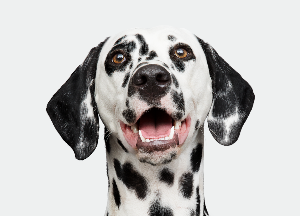
Our hero’s:
The original Scalibor brand featured a dog illustration inspired by the Excalibur/King Arthur story. However, after conducting an extensive survey with marketing managers in the top six countries where Scalibor is sold, we found that this illustration style didn’t contribute significantly to the brand equity in the transition to a new design.
In the design phase, we opted to sketch with a Dalmatian, aiming to establish a memorable connection with the buyer. We explored a photographic solution, aligning with the modern approach in the market. Our design deviates from the formal portrayal of heroes in the market, instead capturing the joy of life in a dog’s exuberant reaction to the word ‘walkies,’ radiating excitement and happiness.
Despite varying opinions from marketing managers – some suggesting a darker coat for improved collar visibility and others proposing more popular breeds tailored to specific country audiences – extensive testing was conducted to determine a direction. The result: a Dalmatian symbolizing a large animal and a Boston Terrier representing a small one. Our choice of these breeds reflects real-life situations, where encounters with a Dalmatian or a Boston Terrier inevitably grab attention, leaving a lasting impression due to their unique characters.
Collar:
After reviewing the previous design, we noticed that the collar was only represented through text to our target audience. To address this, we made an effort to emphasize the collar with a visual depiction. By playing with scale, we highlighted the collar’s importance visually, aiming to create the appearance that you are applying the collar to the dog, and that the dog is happy and appreciative of the gesture.

Colour:
Another insight from the survey with marketing managers in the top six countries was the desire for the Scalibor brand to adopt a scientific/medical approach, using white as the main colour. Having looked at length into the competition, we saw an opportunity for Scalibor to go in a different direction. When we presented our first sketches featuring a bright yellow package, we sparked quite a debate.
Our reasoning was that competitors offering new solutions, such as chews and pour-ons, had a stronger basis to claim the scientific angle. We didn’t find anyone asserting the idea that this product imparts dogs with a sense of freedom and carefreeness without the risk of disease, so we questioned the survey results.
Before launching the new Scalibor brand, we carried out a detailed survey, testing our theories with existing customers and non-customers from Spain, Germany, and Italy. The survey results supported our thoughts; the packaging featuring yellow as the main colour performed far better than with a white colour.

Typography:
The Scalibor brand utilizes two distinct typefaces, Brush Up and FS Albert Narrow, that complement each other. They were chosen to support the choice in colour for the brand, as well as to reflect the characteristics of breed and expression for both large and small dogs. Brush Up, a cool, hand-painted typeface, is specifically chosen to infuse energy, impactfulness and joy into the Scalibor brand. In the packaging,
Brush Up is utilized to highlight the most important benefits and features, capturing the target audience’s attention.
FS Albert Narrow, on the other hand, is charismatic, warm, and friendly. It comes in various weights, ensuring functionality and easy readability.
Global consistency:
Our goal was to maintain a strong and exciting visual identity while allowing enough flexibility for local marketing teams to optimize their packaging applications to the best of their abilities. Additionally, we provided support during the production phase to ensure seamless implementation.
Drawing on our extensive experience in producing guidelines for MSD Animal Health, we createa a comprehensive set, accompanied by templates, empowering local marketing teams to apply the visual identity across the entire range of packaging applications. These guidelines took into account local specificities, including language length and regulatory requirements.
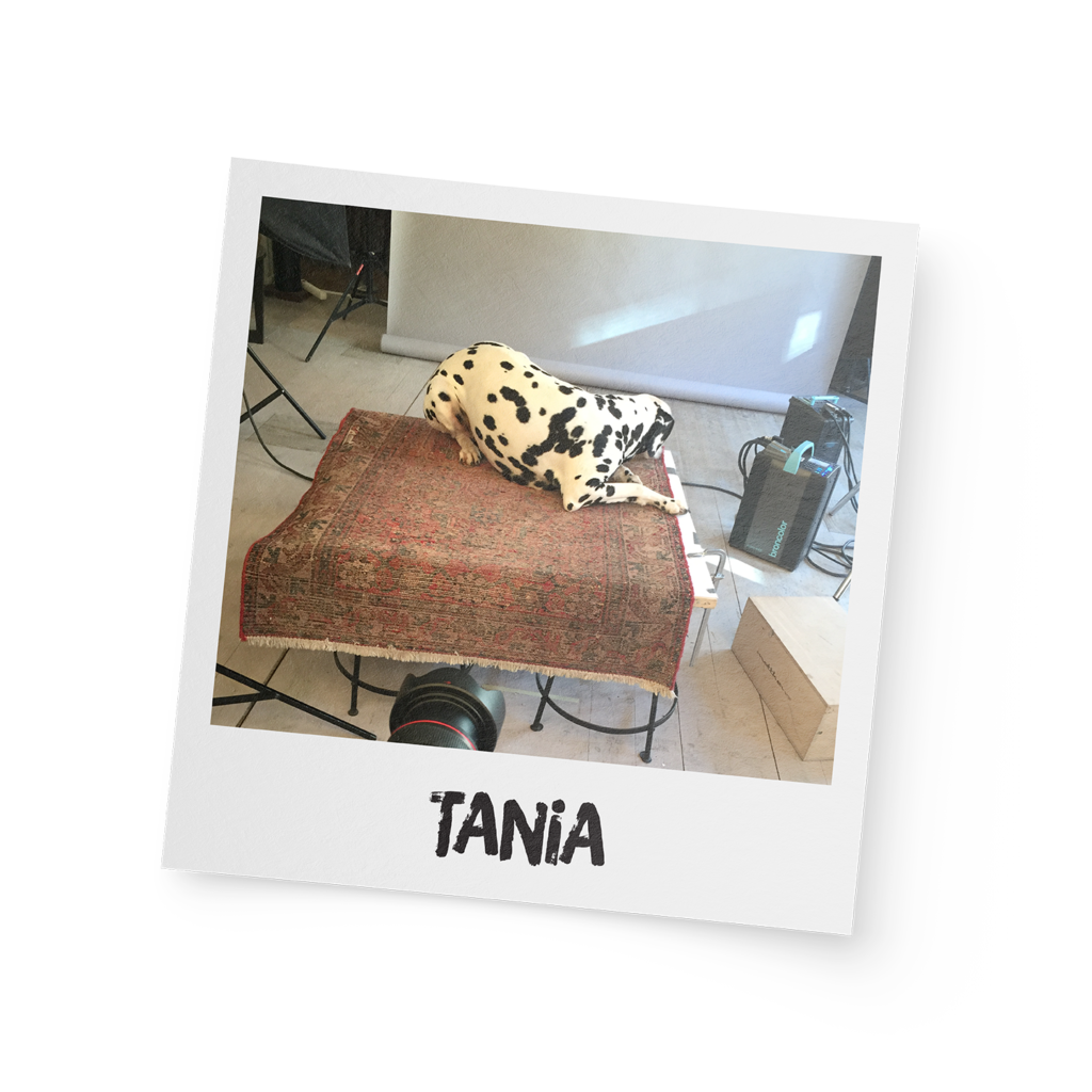
Fun fact:
Our first-choice Dalmatian model had an unexpected aversion to camera flashes. Despite our best efforts, treats proved futile in changing Tania’s mind. So – always have a backup plan, especially when dealing with our four-legged friends.
Innovative strategies with human-centric storytelling! B2B Influencer Marketing is key to reaching your target audiences.